
Inside the Material Color World
A Q&A with the Material design team.
Q:
How do you think about the Material color world?
A:
The Material color world is both optimistic and grounded. It's about duality.

Q:
When adding a new color, what do you consider?
A:
There are several factors we consider when introducing a new color. First and foremost is asking the question, will it resonate with the discerning Material customer? We will also consider how a potential new color fits with the assortment overall (is it bringing newness and also does it feel right for the particular product, and material execution?). We like to dig deep on how a potential new color feels within the context and palette of the modern kitchen or table. Overall, I'd say our color approach to tableware can be more nuanced and classic, as opposed to the colors we choose for kitchenware—which can be more punched up and playful. Seasonality can also be a factor.


Q:
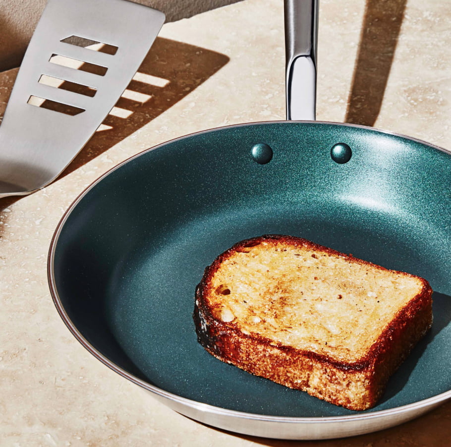
How did you decide on the new Coated Pan color? What drew you to it?
A:
Sky blue is a very relevant color for Spring/Summer 2024. There's an airy gentleness inherent in all expressions of sky blue, but this particular shade felt special because it has just a tiny hint of lilac.

Q:
How do you want customers to feel when they cook with this new color?
A:
I hope that this color promotes feelings of tranquility and peace.


