Q:
In your own words, what was the inspiration behind the Material Object collection?
A:
In early 2022, we started regularly interviewing some of our favorite people, asking them to share the stories of deeply sentimental items found in their kitchens. Across the board, individuals chose hand-me-downs, travel keepsakes and furniture but they all shared a few key elements. Without fail, these were extremely functional items full of personality and decorative flair. In short: these items make their house feel like a home. We set out to create a collection inspired by these stories. Unique, everyday essentials, crafted in small batches, these are beautiful items you’ll reach for every day.

Q:
Why did you start the Material Object collection with The Salt Sphere?

A:
So many reasons! Salt is a building block of flavor but it’s also a tactile experience shaped by personal preferences. How much to salt, when to salt, what type of salt – these are all decisions that any home cook must become comfortable with to really excel in the kitchen. It’s also something that gets passed around the table, creating moments of physical connection. Lastly, it’s always out on most counters, within easy reach, so it has to be beautiful.
One of the tips that you always hear from seasoned cooks is you need to feel the salt and feel confident in your ability to season with salt. I think it’s a really pivotal moment in a lot of home cook’s journeys where they’re not measuring it out, they learn how to salt-to-taste. It’s really interesting to start at this critical place.
Q:
What was the inspiration behind The Salt Sphere? Could you walk through some of the design inspirations that drove the creative process?
A:
We started in our own homes. I turned to a beloved salt well from my own kitchen that I continued to use, despite it breaking down because it was just so essential to my cooking. Jennie, from our design team, pulled a vintage sugar bowl of her father’s from her own collection. We talked through what made these tools with the same essential purpose but such different designs so special to us and why we continued to use them.
From there, the team delved deep into creative inspiration, everything from Danish wooden pepper mills to the work of Sol LeWitt and antiques we’d found amongst ourselves, bringing together elements of all to create something entirely new.


Q:
Were there any problems you were hoping to solve?
A:
I think a lot of what’s on the market just looked very much the same and we wanted to break out of that. We wanted to create an object that really made a design statement and elevated the position that salt has in our pantries. You reach for it everyday, maybe even multiple times a day, so it should be pleasurable and beautiful.

Q:
Could you walk us through the design process?
A:
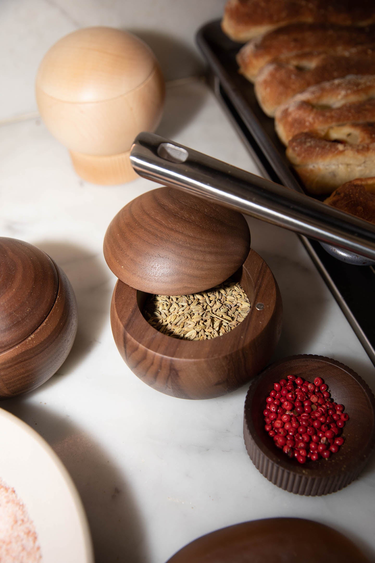
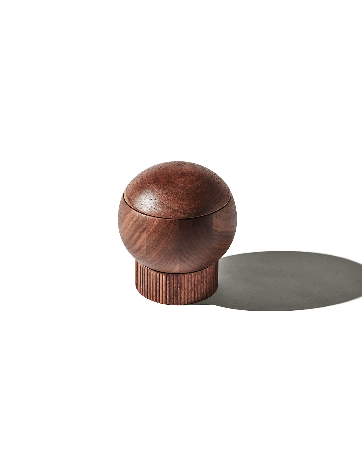
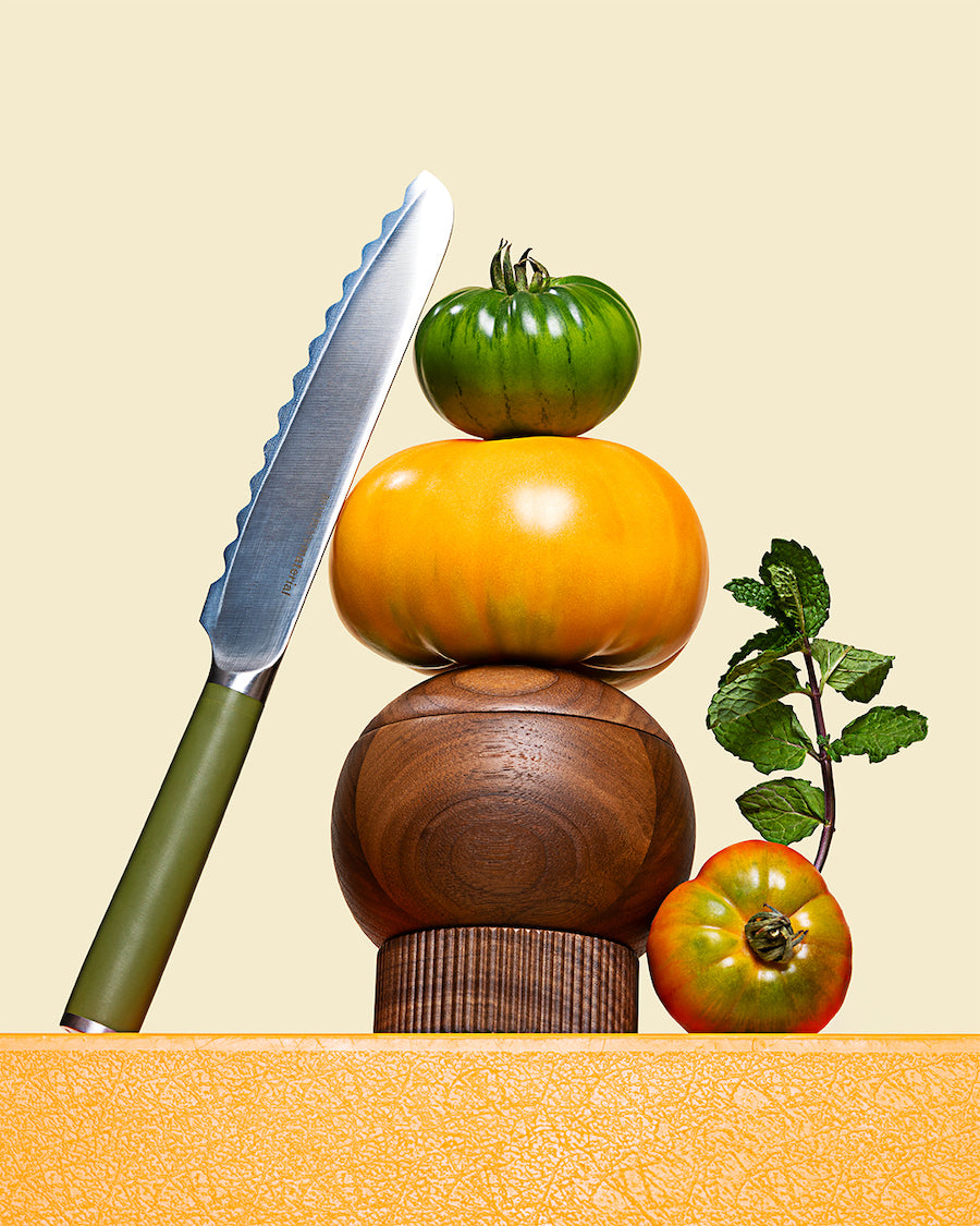
Very quickly we settled on a few non-negotiables: It must be large enough to dip your hand in and pull out a solid pinch of salt.It should have a sculptural element, making a statement on your countertop. It should be versatile. And last but not least, we felt strongly that it should be a sphere with a swivel top, making it easy to hold and open with one hand.
One of our favorite elements to develop was the base. From the start, we felt strongly that there should be some sort of stacking element, allowing for storage and a special reveal moment. We tried out different materials and at the last minute added on the fluting, which I think adds such a special touch.Once we settled on the shape, we start sketching out designs and developing 3-D prints.
As far as materials go, we tried a number of different options but kept going back to wood. We use FSC-certified wood, so it’s a sustainable material that just gets better with age. It will develop this beautiful patina, whether you have the walnut or the maple.
Once we develop a prototype, we live with them for awhile. That allows us to see if something is too narrow, too wide, too tall, etc. For example, I realized that the opening to the sphere had to be made larger to fit a variety of hand sizes. My hand fit in the original but it was just a tad too small for my husband’s. Another important part of this is just seeing if there’s a need for it. Does it become something that I and my husband reach for and will miss when the prototype goes back to the office? If not, then we either need to reconsider the product entirely or change the design. If it’s not necessary, it doesn’t belong and that emotional connection will never develop.From there, it’s finishing touches. Small tweaks, developing packaging and getting it out into the world.

Q:
Was there anything that didn’t make it into the design?

A:
Oh yes. Lots of things. For example, for a long time we designed with a small metal handle on it, that you’d use to open The Salt Sphere and give it a splash of metallic flair. But it broke up the clean line of the sphere and we just couldn’t reconcile that with our vision. Also, it just made it feel less special. Almost more like something you’d find somewhere else.
Q:
How did you think of adding the finishing salt dish / pedestal?

A:
We kept coming back to a footed design but we also wanted this super clean sphere, so the engineering of those two ideas was difficult. That led us to exploring this stacked base. Once we started playing with it and saw the versatility this gave the design, allowing for storage of finishing salts, sugar, spice blends – you name it, and the added dimension it gives to the design, we were all in. That extra height makes it pop on your countertop and the base is beautiful on it’s own, passed around a table. At the end of the day, it’s that connection to passing the salt, touching the salt and building flavor in such an individual way that drove the whole process.
